

HIRO is a project born from the manufacturing know-how of its parent company Penta Systems. With forty years of experience in the processing of metals for furnishings, they decided to join a digital revolution that brings the powerful capabilities of its large manufacturing facilities only one click away from any designer.
Their goal is to open the access to high-quality production to design makers through an online platform that both collects orders for production and sells the objects all over the world. They do not art-direct the projects, yet give valuable consultation on production choices; they do not purchase stock and instead allow designers to produce mini-series to avoid high overhead costs; they open the industry to freelance designers in an innovative way, offering industrial power, experienced craftsmanship and removing the intermediation of third-party design brands for distribution.
In 2018, the founders’ idea was transformed in reality with a complete brand and visual identity study, as well as the creation of the web platform and social media channels.
The name HIRO was picked by the founders, who wanted a connection to Japanese aesthetics and home-design products. Although the spelling differs, when pronounced it sounds like the english word “hero”, which the client felt brought a positive energy to the brand as problem-solver.
The brief was developed together with the client, and what emerged is a company that is trying to satisfy the needs of two very different targets with a common interest. For this reason, the designs all took into account some form of “duality”, to be able to decline the logo’s use for each target without loosing its essence.


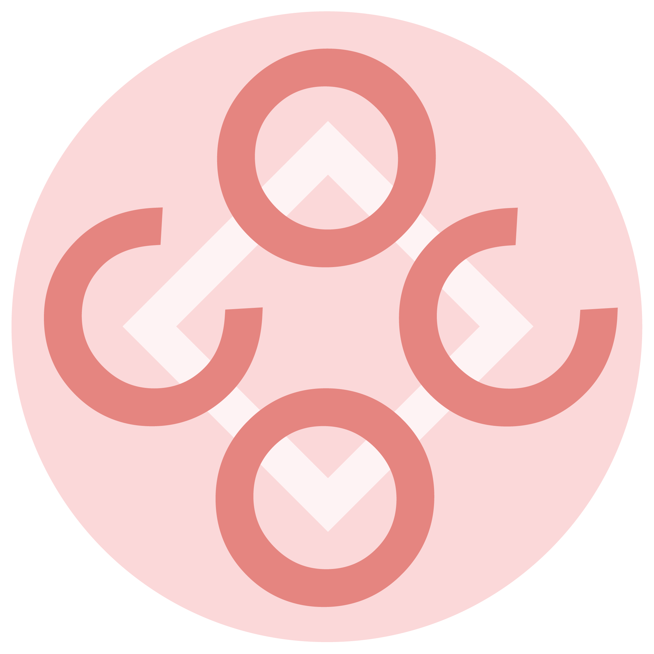
The first round of proposals included concepts representing production aspects:
Top left: The client proposed using the Enso symbol and a visual style inspired by Japanese design, as they felt close to those design values (minimalistic approach, high quality of materials, delicacy yet strength, essentiality yet style, etc). These options and other drafts around this concept were discarded as there ultimately was a desire to proudly represent ‘Made in Italy’ in the brand’s identity.
Top center and right: These concepts are still loosely inspired by Japanese design, specifically their joints (famous for durability, aesthetics, and the craftsman’s expert skills for designing them free from screws, nails, glue, etc). The duality aspect is recalled here with the two elements joining together, and the H of HIRO becomes part of that union, benefitting both. The drafts on the right columns were initially inspired by the crystal structure of the Iron atoms. However, to avoid the similarity to an hourglass, I opted for an horizontal positioning of the geometric elements, which again reminds of Japanese butterfly joints.


Top left and center: From the idea of the joints, I’ve later developed a version of the concept that is more linear and light, with visual elements that can be abstracted from the logotype and become icons on their own. Imagining the logo in motion (since the use would be mostly digital), I also envisioned the shapes changing proportions and opening up to become quotation marks, with keywords that relate to each target.
Top right: The last proposal of the first round took a different direction entirely, and revisited the name to transform it in an acronym for House of iron (being that iron is their most important material). It can be read in two ways that match their targets: for buyers - they are the place to go to buy iron designs for the house; for designers - they are the place to go for creating designs made of iron. The O in HIRO can still represent the Enso symbol (as per client request) and when placed inside the house shape with the two-colored roof, it visually connects the concept of creativity in the household.

After the first round it was decided by the client to move away from narrative concepts after all, and go for a more type-based visual, which could have impact on their digital platform and packaging. Above is an extract of the proposals which followed that request, and which then evolved to the final logo and visual identity.
For the sake of brevity, I’m omitting other drafts, variations and color studies. Below is the final result:

The final logotype uses the initial H as a graphic icon, that can take different colors based on target: black for general use, yellow for designers, teal for e-commerce buyers, and coral for crowdfunding projects. The titles use a font similar to the logo’s and text body uses a light sans-serif, very airy and round to contrast the verticality and thickness of the logo. A complete visual identity guide was also produced for brand cohesion across teams and platforms.
HIRO did not have a need for a lot of printed collateral. They are digitally-oriented in their communication and mostly needed to have physical branding for their packaging. Below are proposals for business cards, letterhead, shipment boxes, and labels to personalize each product by hand.


HIRO’s team often attends design and architecture fairs to promote their services. For these events, they needed a presentation that was quick to read and visually striking to catch designers’ attention quickly. Used as a support to discuss more in-depth aspects of the company,
these slides were designed for both digital and print use.
HIRO’s website was designed to integrate an e-commerce platform as well as back-end for designers to upload their projects for production.
The UI needed to be developed in a way that both created common areas for the website, yet also clearly separated sections for each target. The brand’s voice would be mainly expressed on the website and although there was a search for clean lines and visual lightness, there is a fun attitude communicated through the typography and bright colors.
The UX posed a challenge because the client was set on having a single website for both targets, but we needed to avoid confusion in the navigation. The solution was to keep a simple top navigation which brought the user in different sections which then opened up pathways to other subpages. Breadcrumbs and footer links were added to facilitate the sub-navigation.
Navigation banner examples for desktop (two browser sizes) and mobile.
Extrapolated UI icons, buttons and drop-down menus.


